
Redesigning Instructional Materials for 60+ Teachers Across ReDI's Digital Literacy Program
Improving clarity, accessibility, and consistency in a slide system used across 5 courses and 3,000+ slides.
Context
ReDI's Digital Literacy Program (DLP) offers 5 courses — 3 in German, 2 in English — each with 12 lessons and around 50 slides per lesson. That's over 3,000 slides edited by many different teachers over time, with inconsistent design guidance.
In late 2025, I joined as a volunteer designer to research the existing pain points, redesign the slide template, and create usage guidelines so teachers could maintain it independently. The project was fully remote and solo, with ReDI LAB and DLP coordinators as stakeholders.
Roles: UX and Instructional Designer
Team: Solo project
Timeline: September - December 2025
Tools: Google Slides, Google Forms, Figma
Problem
Inconsistency and Cognitive Overload Were Hurting Student Learning
After years of multiple editors working on the same slides without clear guidance, the materials had become inconsistent and difficult to use. Two concerns kept coming up from the DLP team:
Slides had become cluttered and hard to follow
Teachers had no clear guidance on how to edit or maintain them
Solution
A Redesigned Slide Template + Comprehensive Usage Guidelines
The redesign addressed both problems in parallel: a new slide template to improve clarity, accessibility, and consistency in the classroom — and a 62-page usage guide to make sure the improvements would last.
The Template
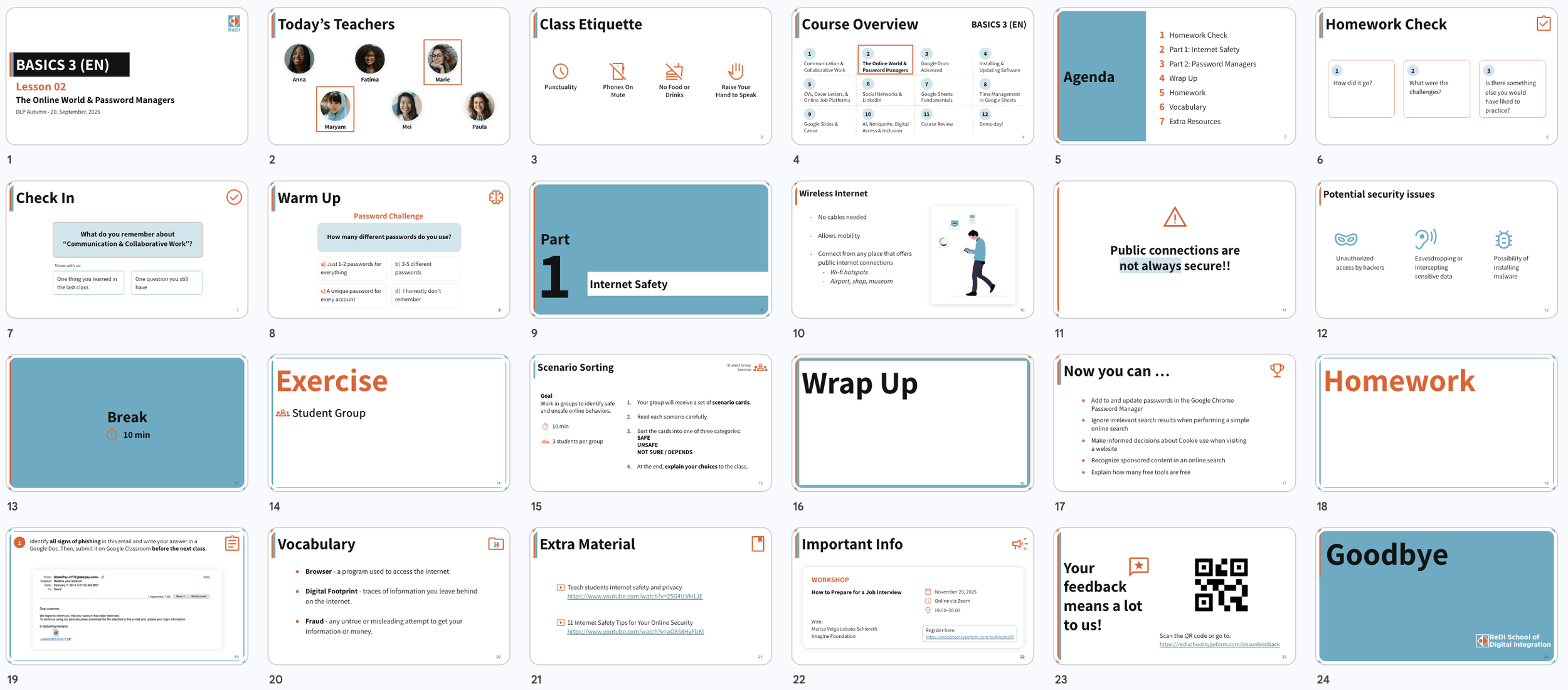
21 slide types
39 layouts
04 lesson phases
Each designed to reduce cognitive load for students and make lesson preparation easier for teachers.
The Guidelines
62-page documentation system covering 05 areas
How to
Lesson Structure and Slide Types
Design Elements
DOs and DONT’s
Theme Layouts
All fully documented so any new teacher or team member could onboard independently, and keep the design consistent.
Research
Understanding the Teachers and the Learners
Teachers: Survey Research
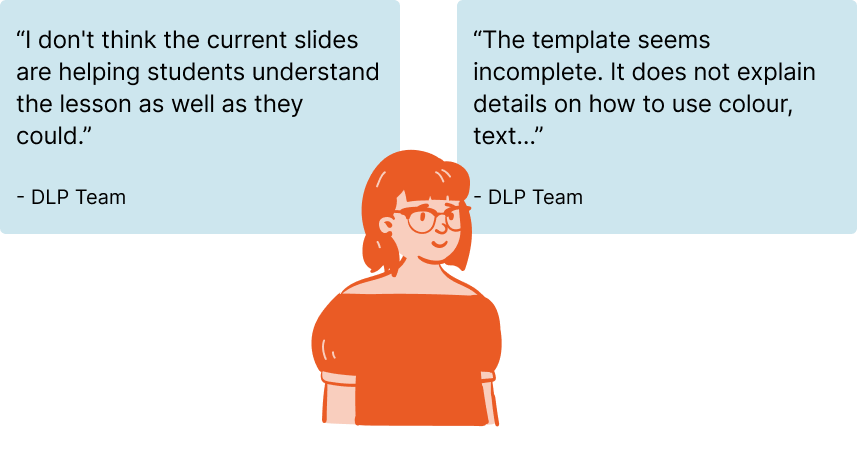
To understand how teachers actually used the materials, I ran an online survey with 15 DLP teachers covering class structure, usage patterns, visual design, and overall satisfaction. The results were mixed in an interesting way.
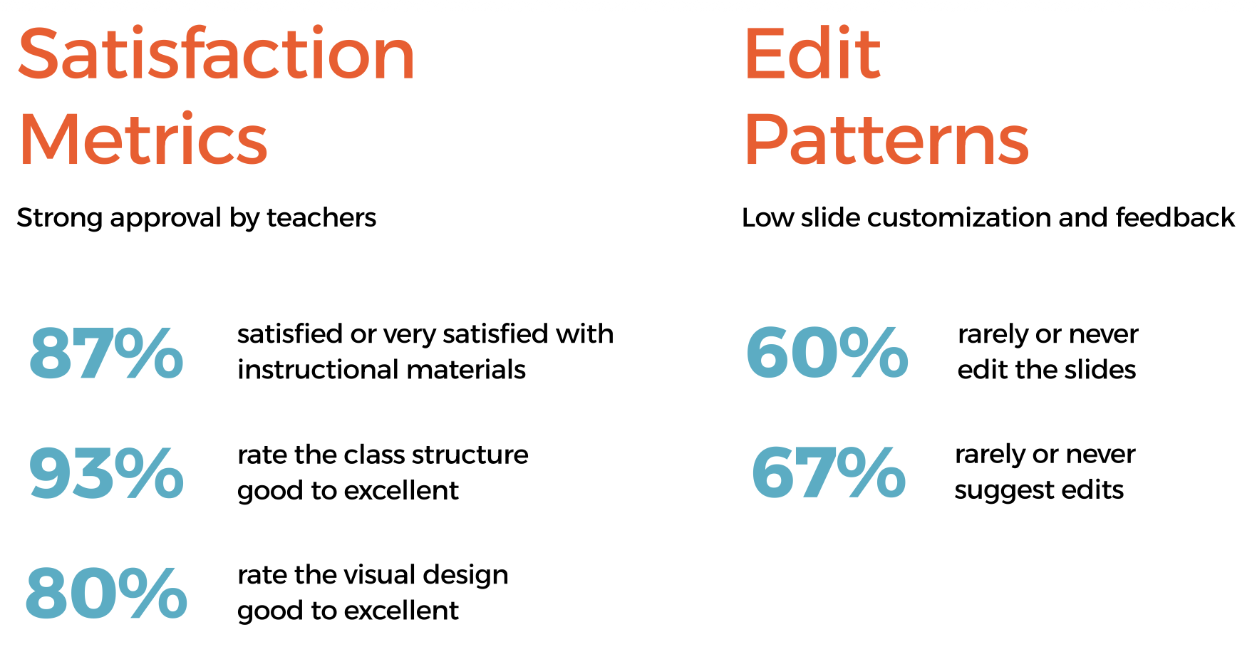
The numbers looked great.
But the open answers told a different story.
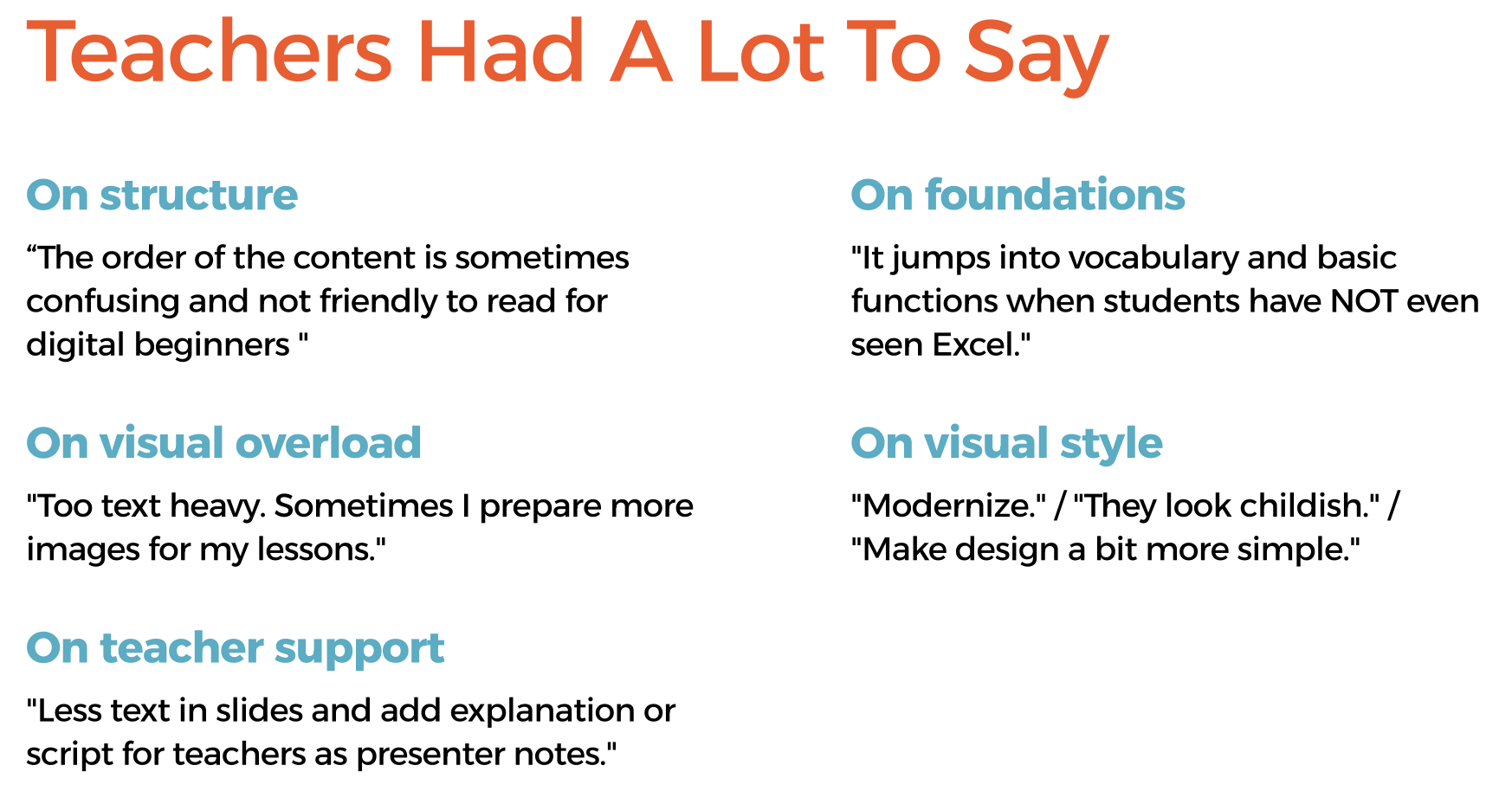
This gap between high satisfaction scores and specific qualitative concerns shaped the entire design direction: the problems weren't obvious enough to show up in ratings, but real enough to affect learning.
Learners: Pedagogical Research
In parallel, I reviewed literature on teaching adults, migrants, and multicultural audiences to understand what the design needed to support beyond aesthetics. Key findings informed specific design decisions:
Adult learners connect new knowledge to life experience — discussion slides should reflect that
Multicultural groups benefit from peer learning — group exercises needed to be preserved and clearly signposted
Learning in a second or third language increases cognitive load — visual clarity and reduced text per slide are not optional
Challenge
How might we redesign the DLP slide template to make lessons easier to teach, more engaging for students, and simpler to maintain across courses?
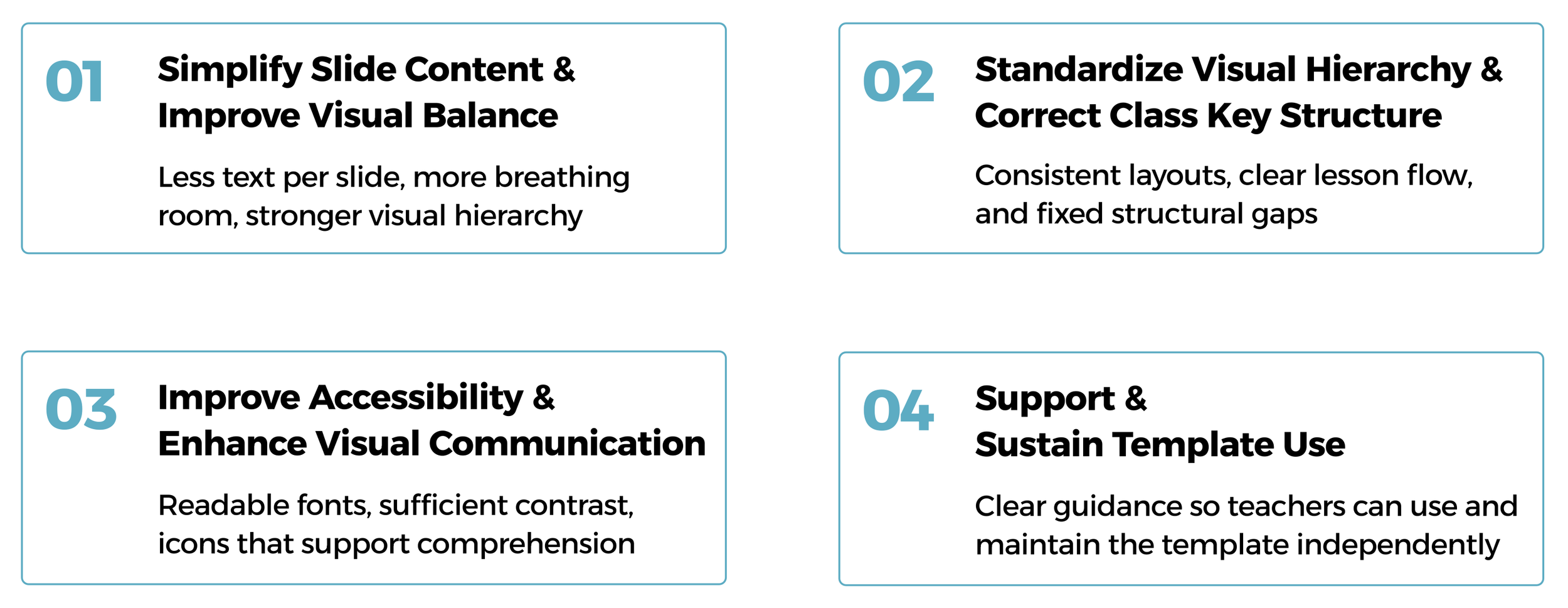
Design Principles
The Four Principles That Guided the Redesign
Principles in Action
Principle 01 - Simplify Slide Content & Improve Visual Balance
Before
After
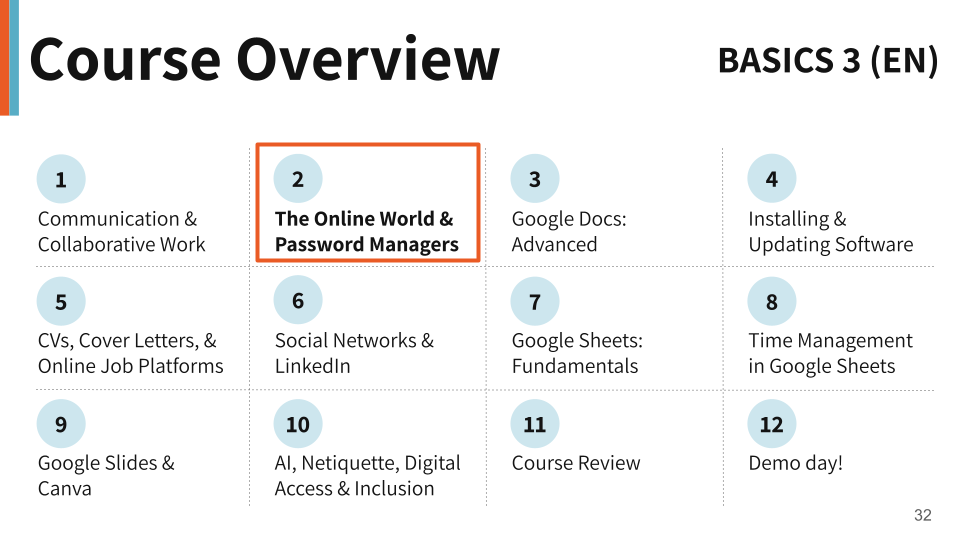
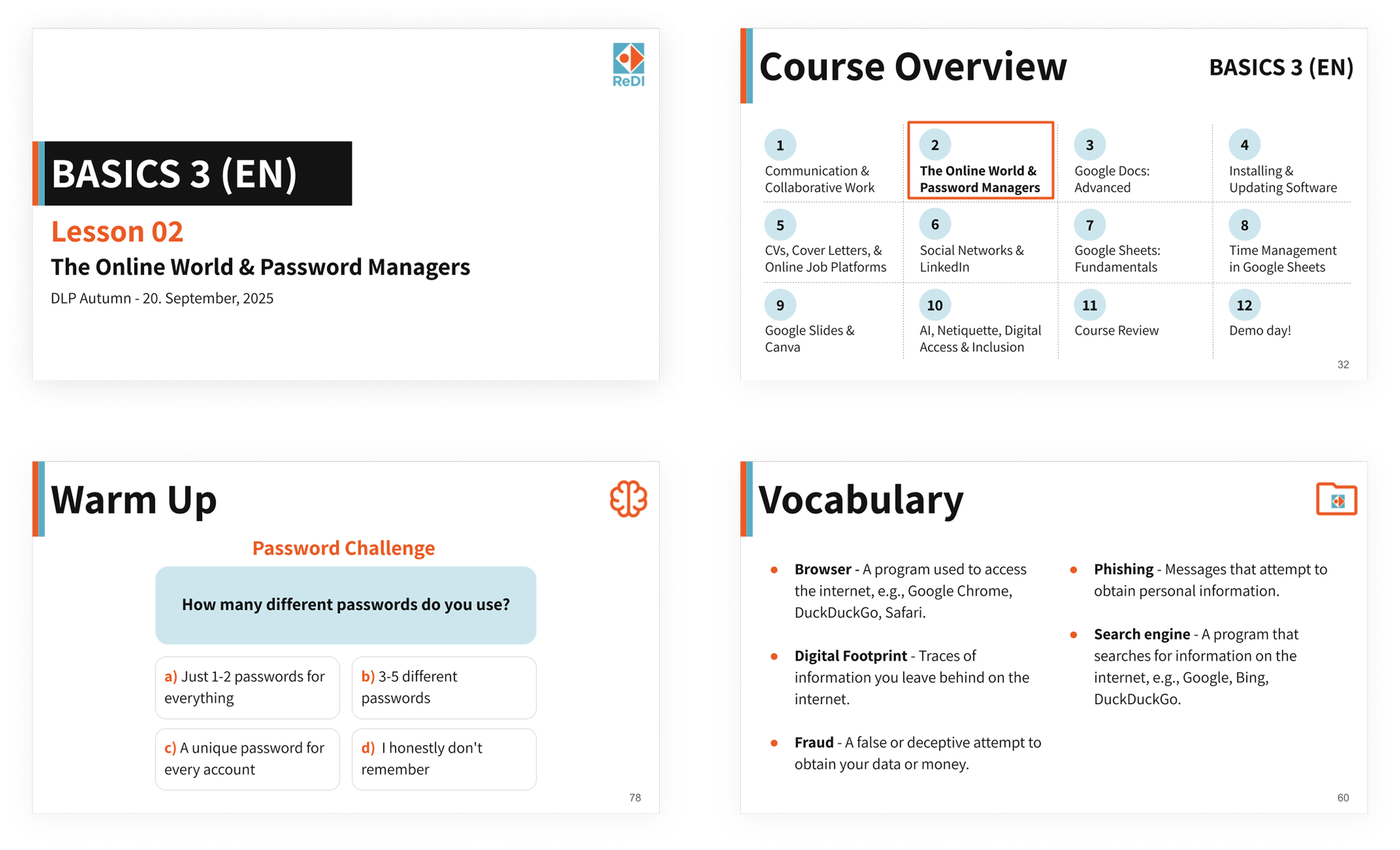
Course Overview: The original tried to show every lesson objective on one slide, resulting in dense text columns that were impossible to scan. The new version shows only lesson titles with numbered circles, making the course structure clear at a glance.
Before
After
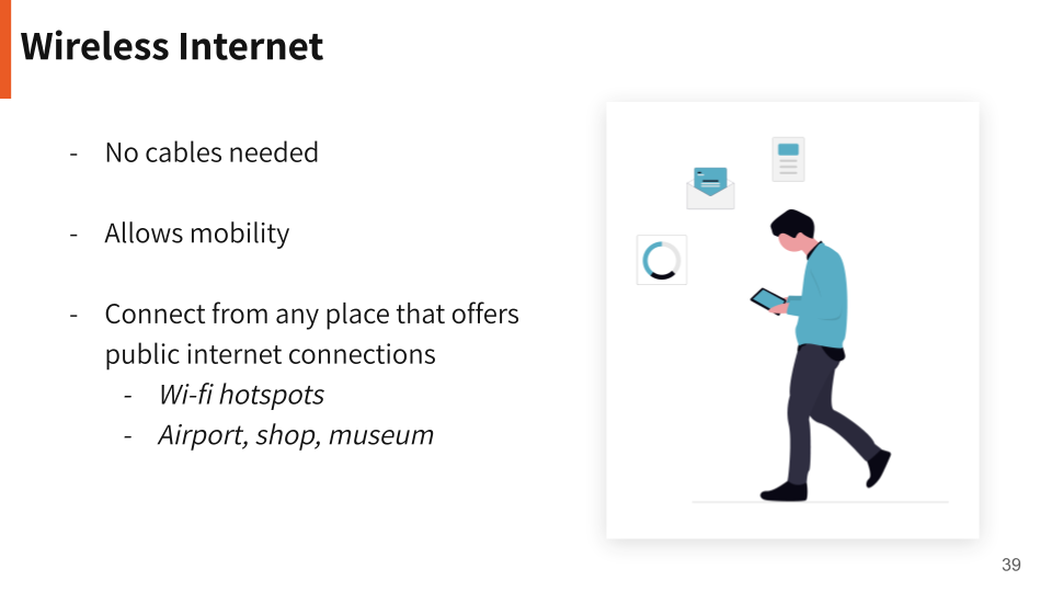
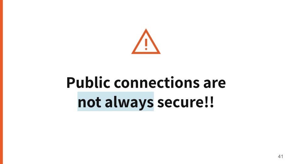
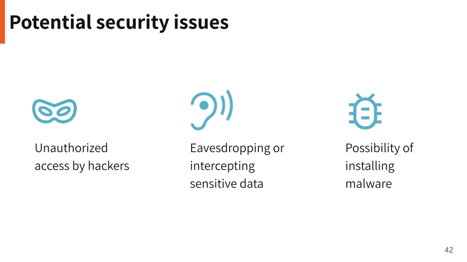
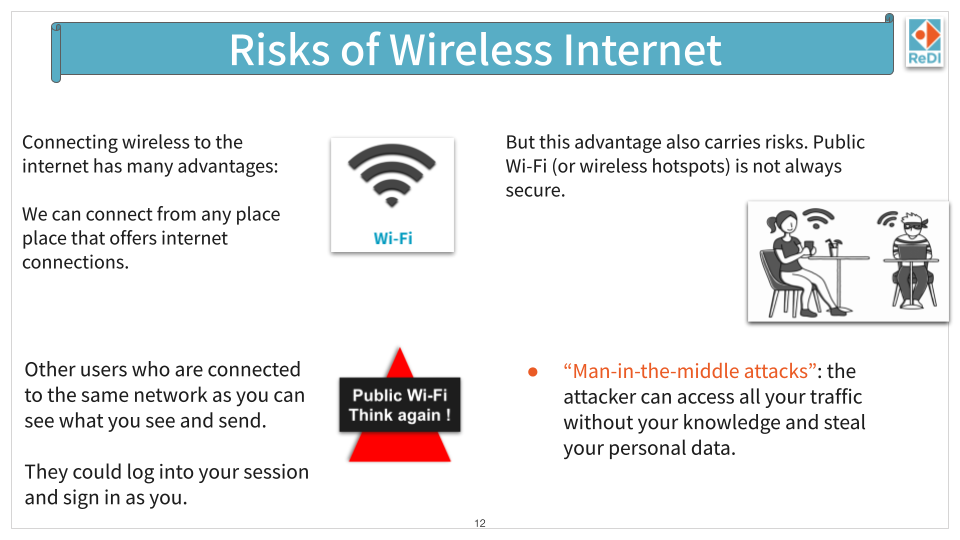
Theory — Wireless Internet: The original mixed text blocks, clip art, and competing visual elements with no clear hierarchy. The redesign separates the concept across focused slides — one for key points, one for the warning moment — giving each idea the space it needs to land.
Principle 02 - Standardize Visual Hierarchy & Correct Class Key Structure
Before
After

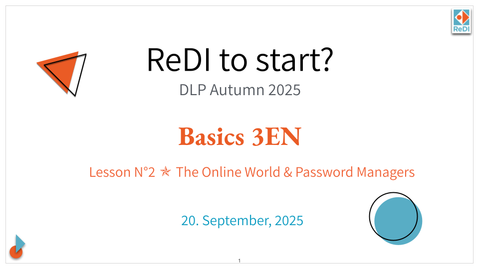
Cover: The original had no clear reading order — the course name, lesson title, and date competed for attention at the same visual weight. The new cover establishes a clear hierarchy: course first, lesson second, date last.
Before
After
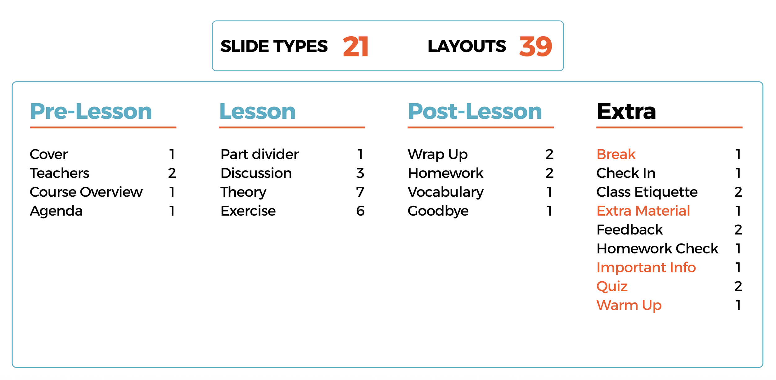
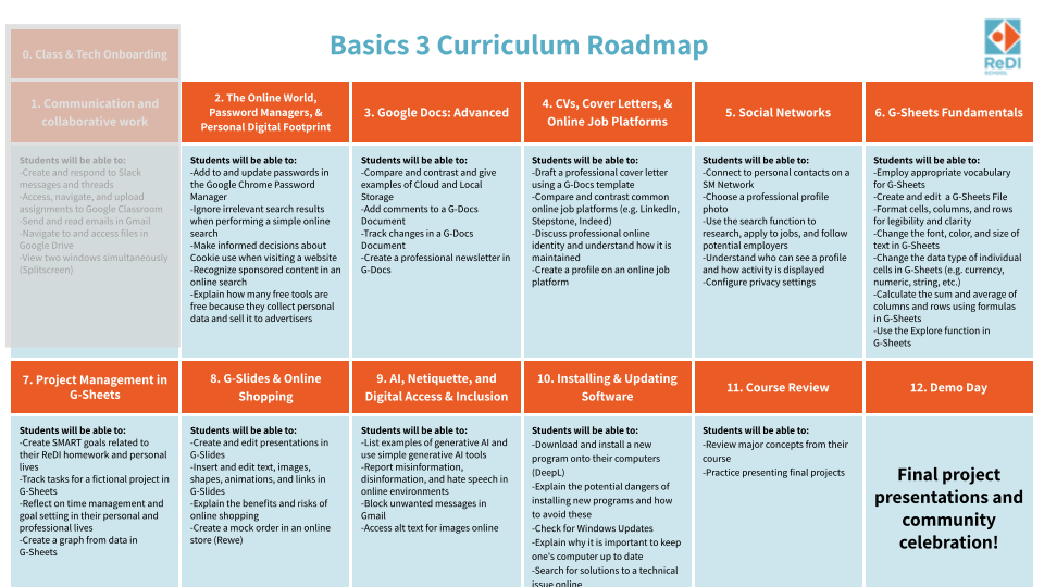
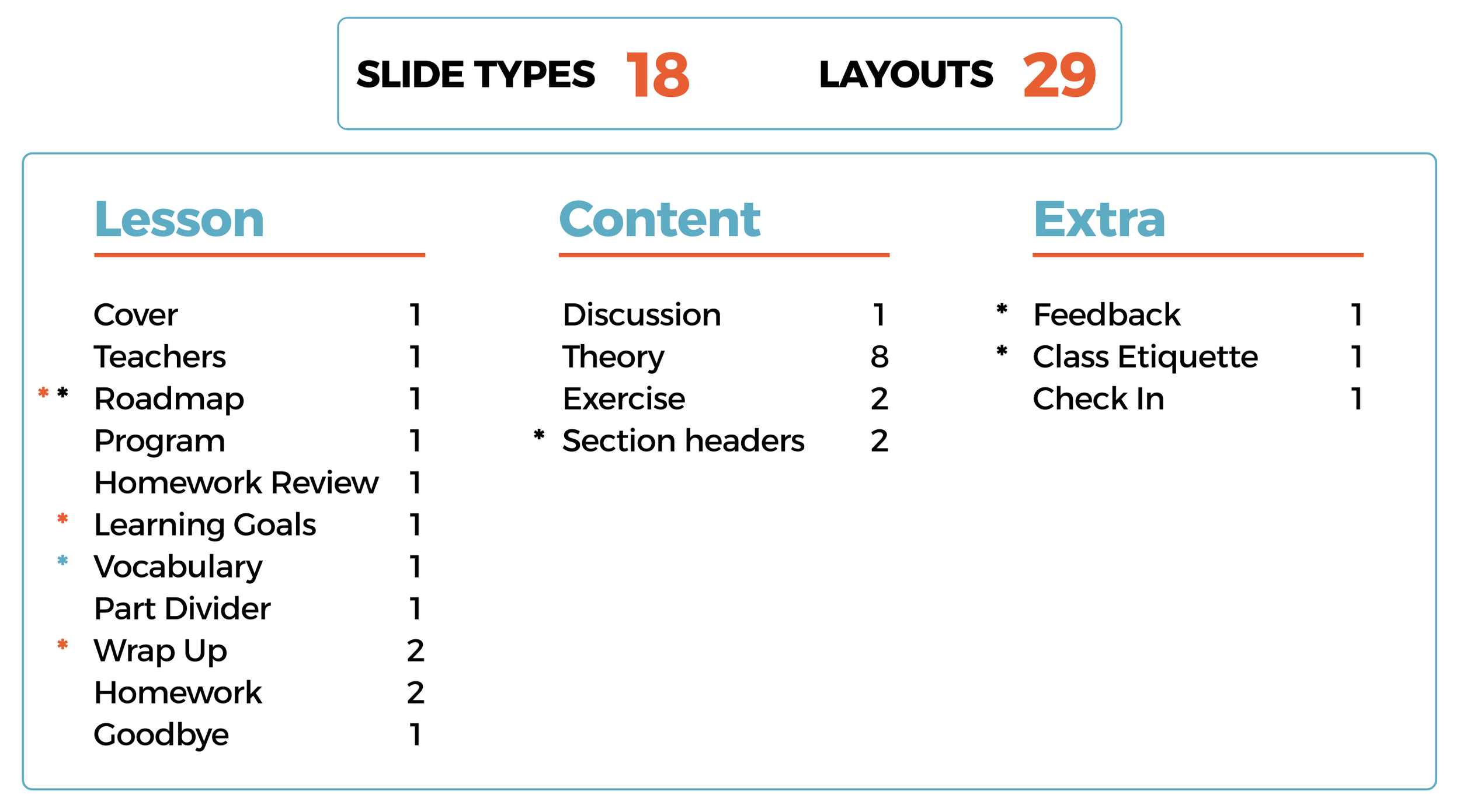
Layouts: The original template had 18 slide types and 29 layouts, with gaps in the lesson flow. The redesign expanded to 21 slide types and 39 layouts, organized into four clear phases: Pre-Lesson, Lesson, Post-Lesson, and Extra.
Principle 03 - Improve Accessibility and Enhance Visual Communication
Before
After
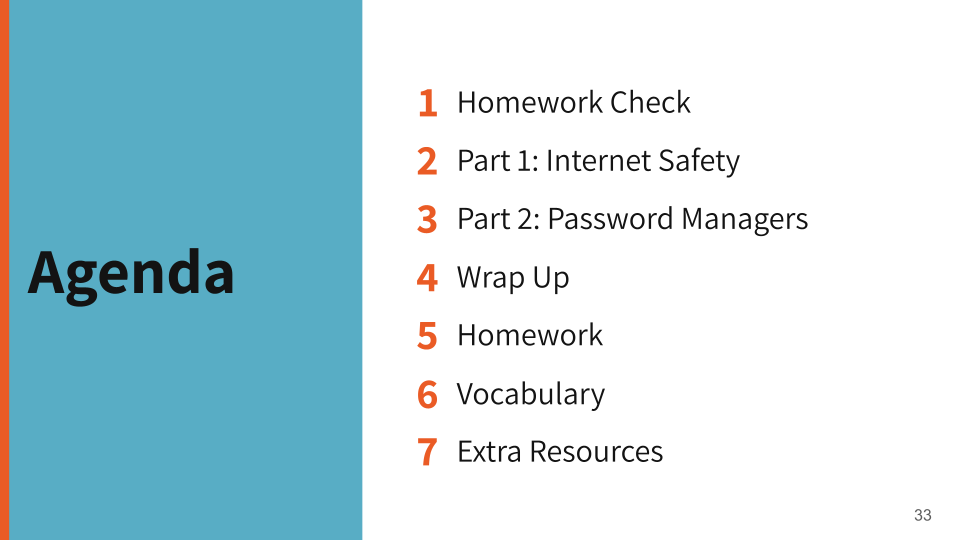
Agenda: The original placed the agenda list on a colored background with low contrast, alongside a decorative illustration that added no informational value. The new version uses high contrast, large numbered items, and removes decorative elements that distracted from the content.
Before
After
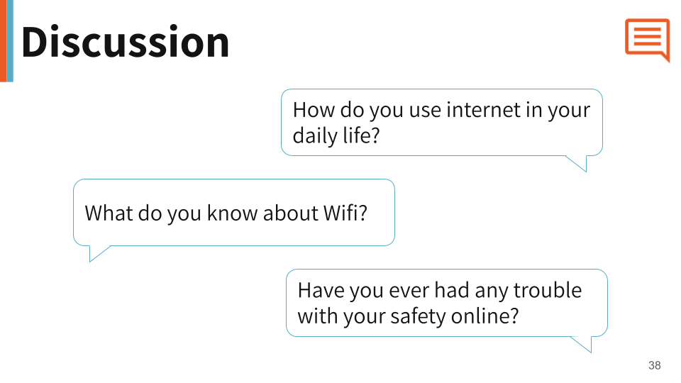
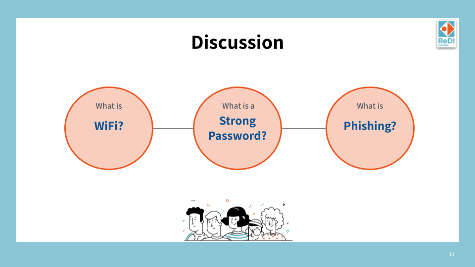
Discussion: The original used circle diagrams with small text inside, which were hard to read and didn't feel conversational. The new version uses speech bubble shapes that visually communicate the idea of discussion before a single word is read.
Before
After

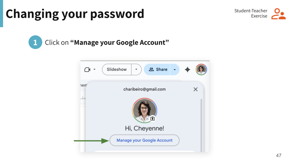
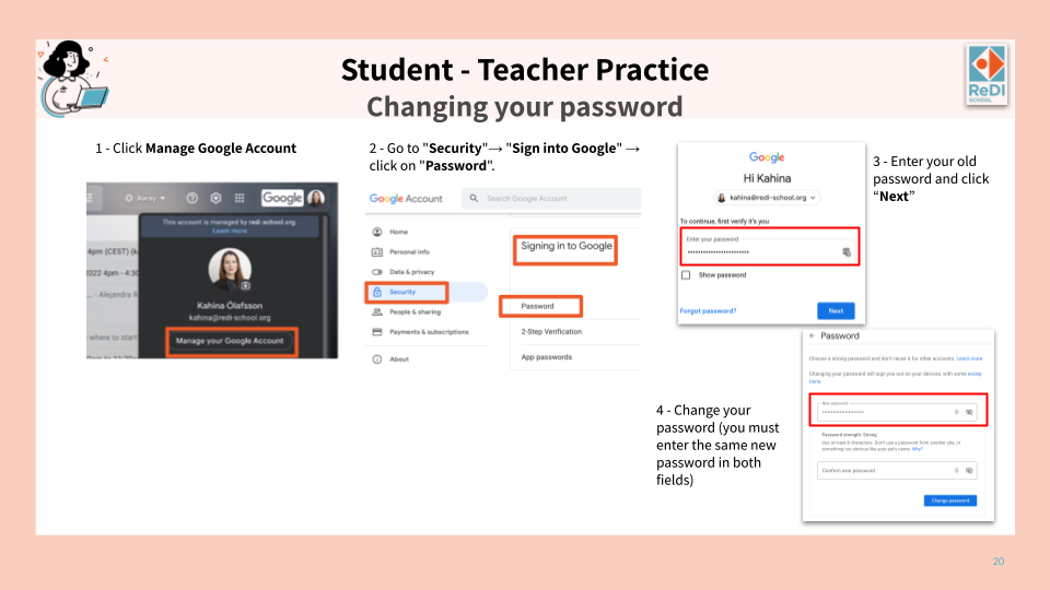
Exercise: The original packed all four steps of an exercise into one cluttered slide with screenshots at different scales and inconsistent labels. The redesign splits the exercise across focused slides — a clear header slide signaling the activity type, followed by one step per slide with a consistent layout and clear visual indicators.
Principle 04 - Support & Sustain Template Use
A well-designed template can degrade quickly if there is no guidance on how to use it. Principle 04 was about making the redesign last — by creating documentation that any new teacher or team member could follow independently
The Usage Guidelines
Designing for Longevity
I created a 62-page usage guide so any new teacher or team member could onboard independently, without needing to ask anyone how the template works.
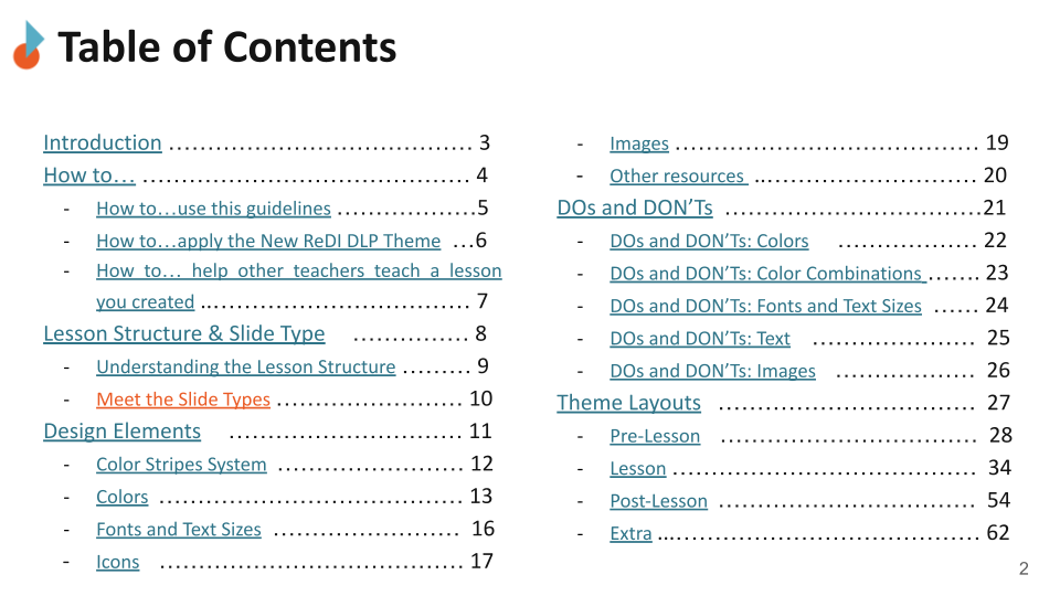
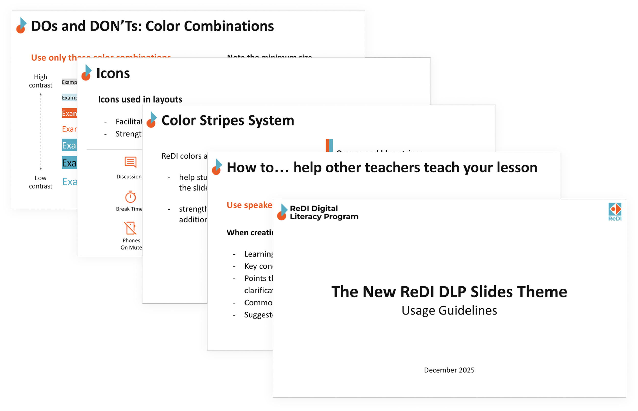
The guide covers six areas — from practical how-tos to detailed layout documentation.
How To
Three practical walkthroughs guide teachers through the most common scenarios: using the guide itself, applying the new theme to existing slides, and helping a colleague teach a lesson they created.
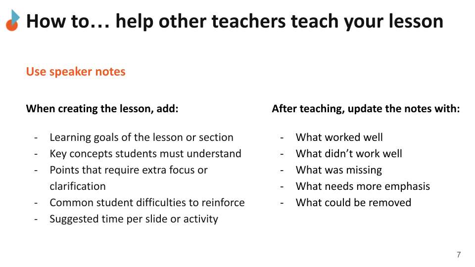
Speaker notes guidance helps teachers pass on their lessons to others — documenting what worked, what didn't, and what needs more emphasis
Lesson Structure and Slide Types
The guide explains the full lesson flow and introduces all 21 slide types organized into four phases: Pre-Lesson, Lesson, Post-Lesson, and Extra. Each slide type has a clear purpose so teachers always know which one to use.
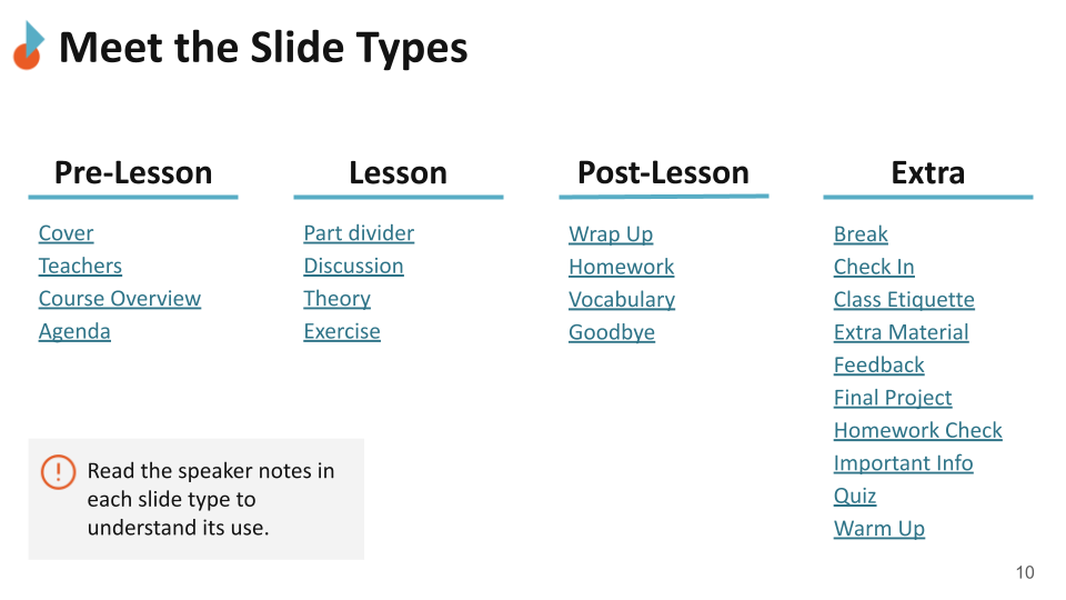
21 slide types organized into four lesson phases, each with a defined purpose and at least one layout.
Design Elements
The design system is documented in detail — color stripe rules, approved color palette, font sizes, icon library, image guidelines, and additional resources.
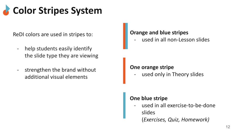
The color stripe system lets teachers and students instantly identify the slide type they are looking at — without reading a single word.
21 icons signal activity types and class etiquette rules, strengthening the brand without adding visual overload. Suggested icons are also available for easy use.
DOs and DONT’s
Specific rules cover color combinations, font and text sizes, text formatting, and image usage — with visual examples for each. The goal was to make the right choice obvious and the wrong choice hard to make accidentally.
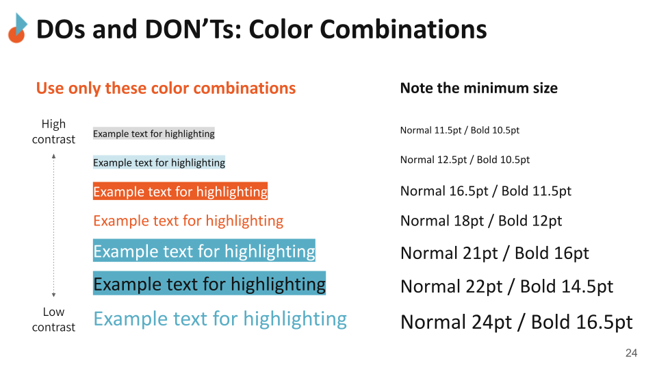
Approved color combinations and minimum font sizes are shown side by side, so teachers can check their slides at a glance.
Theme Layouts
All 39 layouts are documented across the four lesson phases, each with a description of its purpose, instructions for use, and guidance on what to edit each semester.
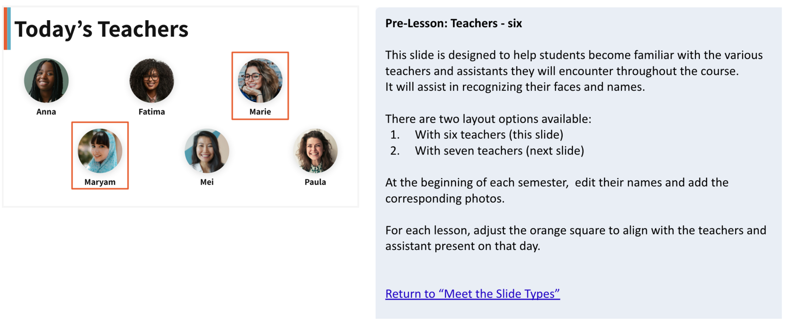
Each layout comes with a plain-language explanation of when to use it and what to edit — designed for teachers, not designers.
Reflection
Lessons to take with me
UX doesn't care about the medium. The questions were the same as any product project: who is the user, what do they need, what gets in the way. The medium was slides, not an app.
Inconsistency is not an aesthetic problem — it is a barrier. When layouts shift unpredictably, contrast is low, and guidance is missing, it is the students who pay the price. Inclusive design starts before color and font choices.
Real constraints make UX more interesting. Working within an existing brand, a volunteer timeline, and a diverse user group pushed the decisions to be more considered than any fictional brief could.
The Template is Ready. The Work Isn’t Over.
The redesigned template and usage guidelines were delivered in December 2025. The next steps are in the hands of the DLP team:
Pilot the template in one course
Survey students on clarity and usability
Gather teacher feedback after real use
Improve the guide based on actual usage
Extend the system to other ReDI programs