
Simplifying Event Discovery for Multi-Generational Communities
Improving community engagement by enabling residents to easily discover and book events through a mobile app.

Roles
Timeline
UX Researcher
UX/UI Designer
8 weeks
April to June 2025
Product
Team
Mobile app
Solo project
Context
This project was completed as part of the UX/UI Design II course at ReDI School of Integration.
Problem
Community engagement is dropping in the events promoted by the ReConnect Community Center
The ReConnect Community Center acts as a vital hub for the local neighborhood by promoting events organized by nearby businesses. They noticed that engagement was dropping and feared the residents were becoming more isolated, and the community was losing its vibrancy.
Events are being advertised only through different social media posts, and the process for searching, booking, and tracking events is very time-consuming and confusing for residents.
So, how to make it easier for residents to engage in events happening in their neighborhood?


Solution
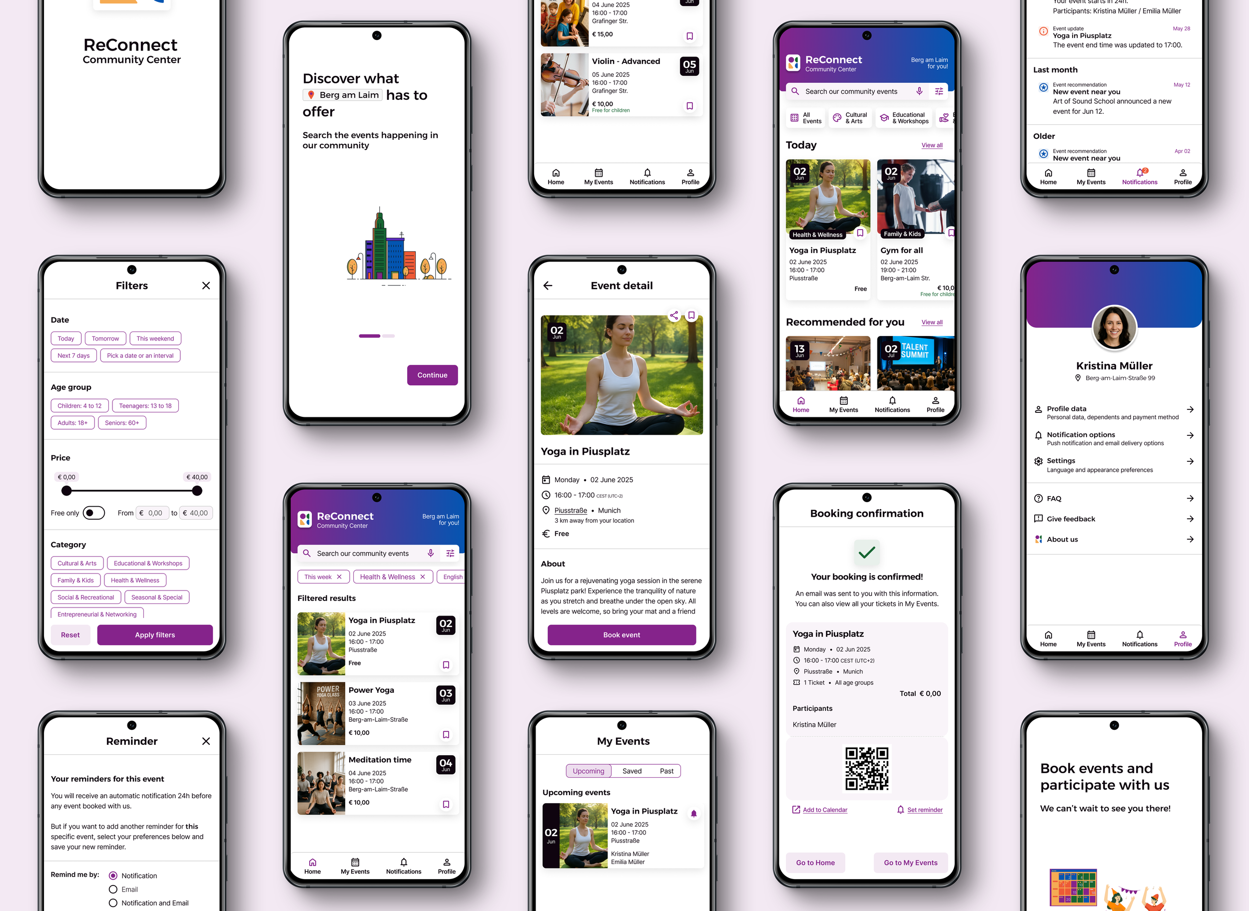
A centralized digital event catalog is the way
Easily discover events to go to
All types of events in one place, instead of checking multiple platforms
Search and many filter options available to quickly find relevant events
Personalized recommendations based on resident interests
Save events for later viewing
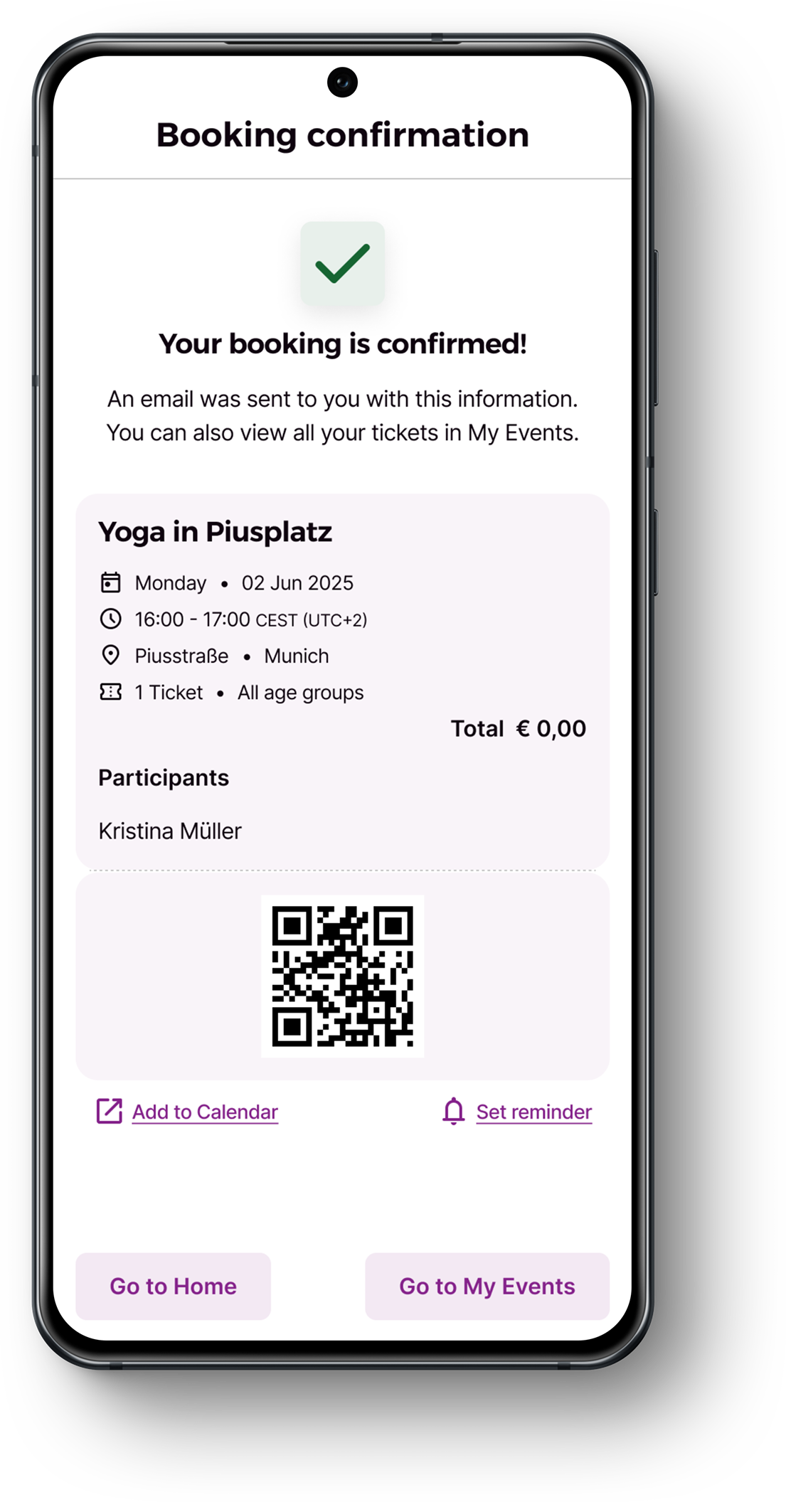
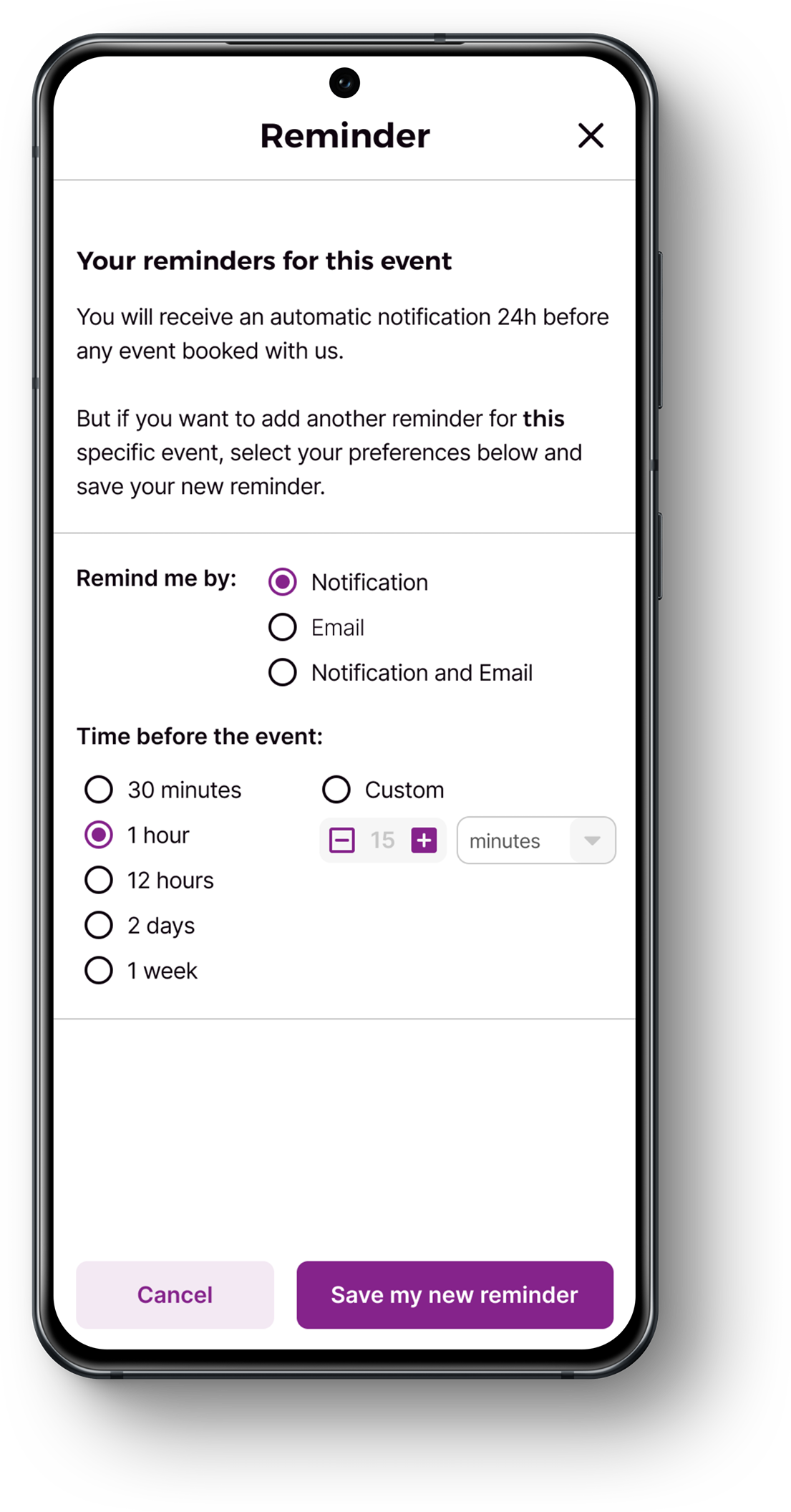
Book in app and be reminded
Detailed event page with all information, including accessibility feature
Book events and manage tickets directly within the app
Add participants to the booking to better manage children's events
Share interesting events to invite and connect with friends and family
Be reminded so that there are no more missed events
Adapt the app to your needs
Manage your interests to receive tailored recommendations
Save your dependents information to speed up the booking process
Define your notifications options to always be on track
Edit the language and theme to better match your needs
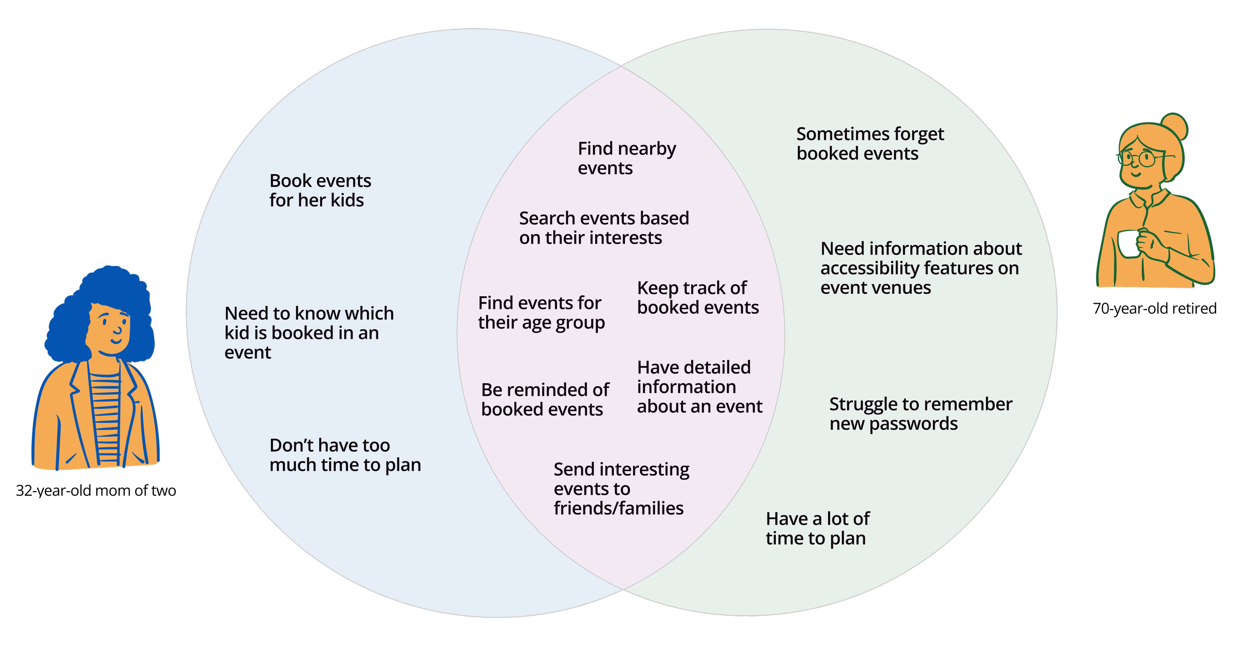
User interviews
Users have very different needs, yet share similar ones
To better understand the struggles users faced and what was important when deciding which event to attend, I conducted interviews with community residents. With the gathered data, I created personas and empathy maps. This way it was possible to identify many common needs, as well as some individual differences.
Challenge
How might we make it easier for residents - of all ages and with different needs - to engage in events happening in their neighborhood?

Empathising with the user helped me to gain a clear picture of the situation. It was also important to consider the community center's goal as a non-profit organization and their desire for the neighborhood to thrive.
Combining these two aspects, I created problem statements and challenge maps, culminating in the main HMW question that guided our solution approach.
Competitive analysis
Competitors user flows have strong and weak points
I conducted a competitive analysis to gain a comprehensive understanding of three popular event apps in Munich: Meet Up, Muenchen App, and Rausgegangen. My goal was to explore their solutions and identify their common features and user flows. I discovered some were clear and straightforward, while others needed improvement.
These apps were not targeted at specific neighborhoods; instead, they featured events occurring throughout the city. To expand my analysis, I also looked into Nebenan and Nextdoor, apps focused on neighborhood engagement. However, I quickly realized that their emphasis was primarily on social interaction, including public forums, private messaging, and other features that did not align with the scope of our problem.

Prototype and usability test
Good flow, but some minor improvements needed
After defining user flows and sketching paper wireframes, I created a mid-fidelity prototype of a mobile app that translated user needs into visual elements and workflows. The idea was to keep well-done elements and design patterns from competitors while enhancing others, tailoring them to our users' needs.
Using this prototype, I conducted moderated usability tests to pinpoint areas for improvement. I also received feedback from peers and teachers.
No major changes were identified; however, our testers highlighted several minor adjustments to enhance the final solution.
What worked well

What to improve
Mid-fidelity
Final design


The style guide
Branding and UI Components

Reflection
What I would do next
Validate the final design with users and stakeholders. It would be necessary to conduct usability tests on the final prototype and also get the stakeholders to ensure the solution aligns with their business goals. Additionally, validating technical feasibility with developers before full implementation is advisable.
Iterate further to polish the design and the app features. Improving accessibility appears to be crucial to ensure the solution works effectively for older community members and individuals with disabilities. Also, develop a management counterpart for local businesses, and the ReConnect team would be the natural way to expand this product.
Measure actual impact when the app is in use. Developing, deploying, and measuring its usage would be important to evaluate the real impact on user engagement. Metrics such as the number of bookings, attendance, new participant retention, and user satisfaction would be some of the key ones to consider.
Lessons to take with me
Good research is key to really understanding the user needs. It was crucial for me to conduct a good user interview and really understand the different needs and pain points of the users. That made some design decisions very clear and straightforward, because there was always a question on the background: “Does the user need/want/benefit from this feature?”.
Asking for feedback helped me grow. In this project, I received valuable feedback from both teachers and peers. Their input helped me identify my mistakes, recognize areas for improvement, and determine what aspects could be disregarded. I felt much more confident in my own decisions, although I had to overcome many doubts along the way.
Details are essential, but an end has to come. Deciding on colours, typography, and the overall look of the UI took me too long, because I was too picky about many details. There was no brand identity to follow, and we had complete freedom to create the UI. Ultimately, I realised that details are crucial to achieving a professional design, but we do not have unlimited time or resources to dig into it forever.