
Supporting 500K+ Munich Commuters Through Improved Disruption Communication
Making public transport disruptions easier to read to help users make better travel decisions
Roles
Timeline
UX Researcher
UX Designer
4 weeks
March 2025
Product
Team
Redesign feature
Solo project
Context
This was a study project completed as part of the UX/UI Design II course at ReDI School of Integration, and has no connection with the Stadtwerke München GmbH, owner and developer of the MVGO app.
Problem
When commuters struggle with disruption information
Munich's public transport system faces ongoing disruptions due to maintenance, staffing, and infrastructure challenges. Realities that aren't going away anytime soon. While the city works on long-term improvements, commuters need immediate access to clear, actionable disruption information to adapt their daily journeys.
So, how might we better support commuters in staying informed and prepared when navigating Munich's unpredictable transport system?
Solution
Improving disruption features to help users quickly find and understand information for better travel decisions
Faster, smarter disruption search and navigation for better trip planning

Clearer, more accessible disruption details for better decision-making

User research
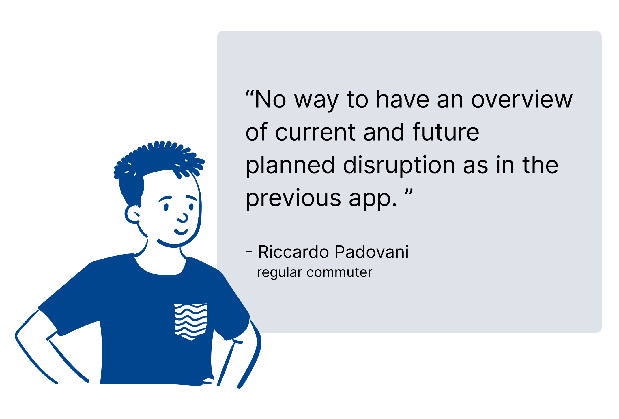
Confusing, unreliable, frustrating: commuters demand better
User research numbers told a story we couldn't ignore. While analyzing user feedback, a pattern emerged that went beyond typical app complaints: commuters weren't just dissatisfied, they were actively being let down by a service they depended on daily.
The research revealed not just what was broken, but why it mattered: missed connections, inability to plan, and lost trust in a tool that should simplify their lives. This wasn't about preference: it was about reliability in moments that count.
The stats tell one story. These quotes tell the rest.


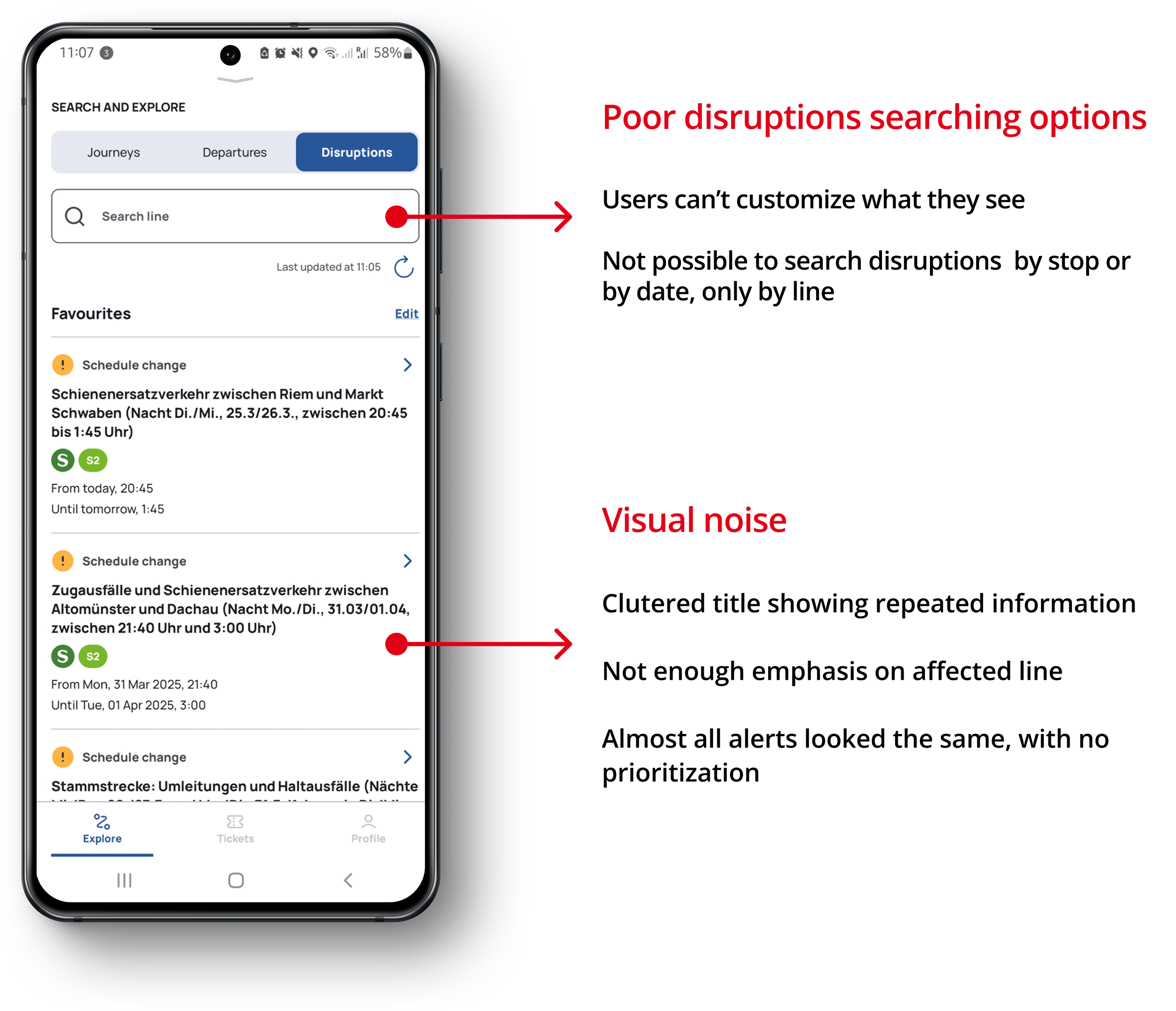
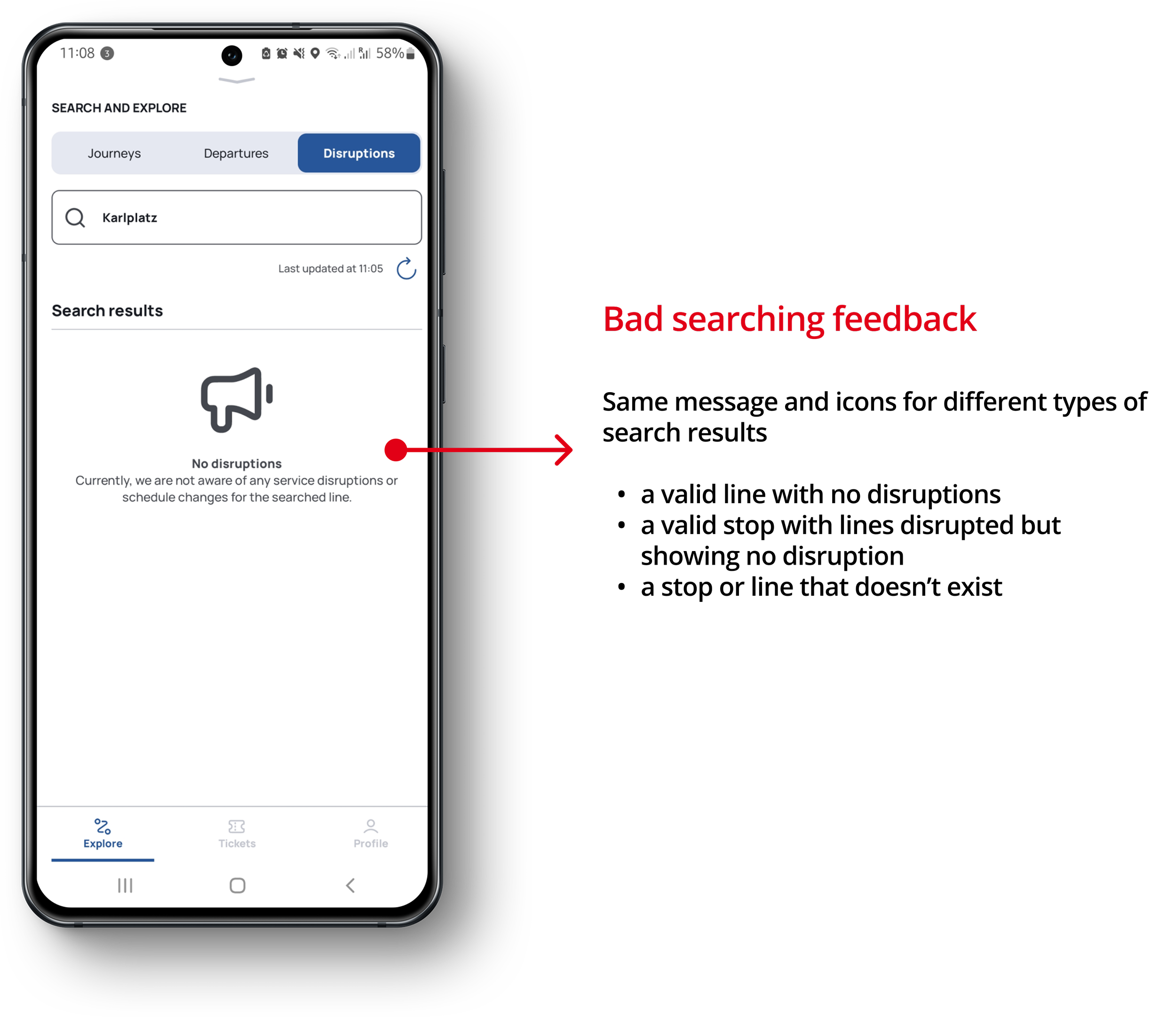
Audit of the existing design
Why commuters struggle with the current app
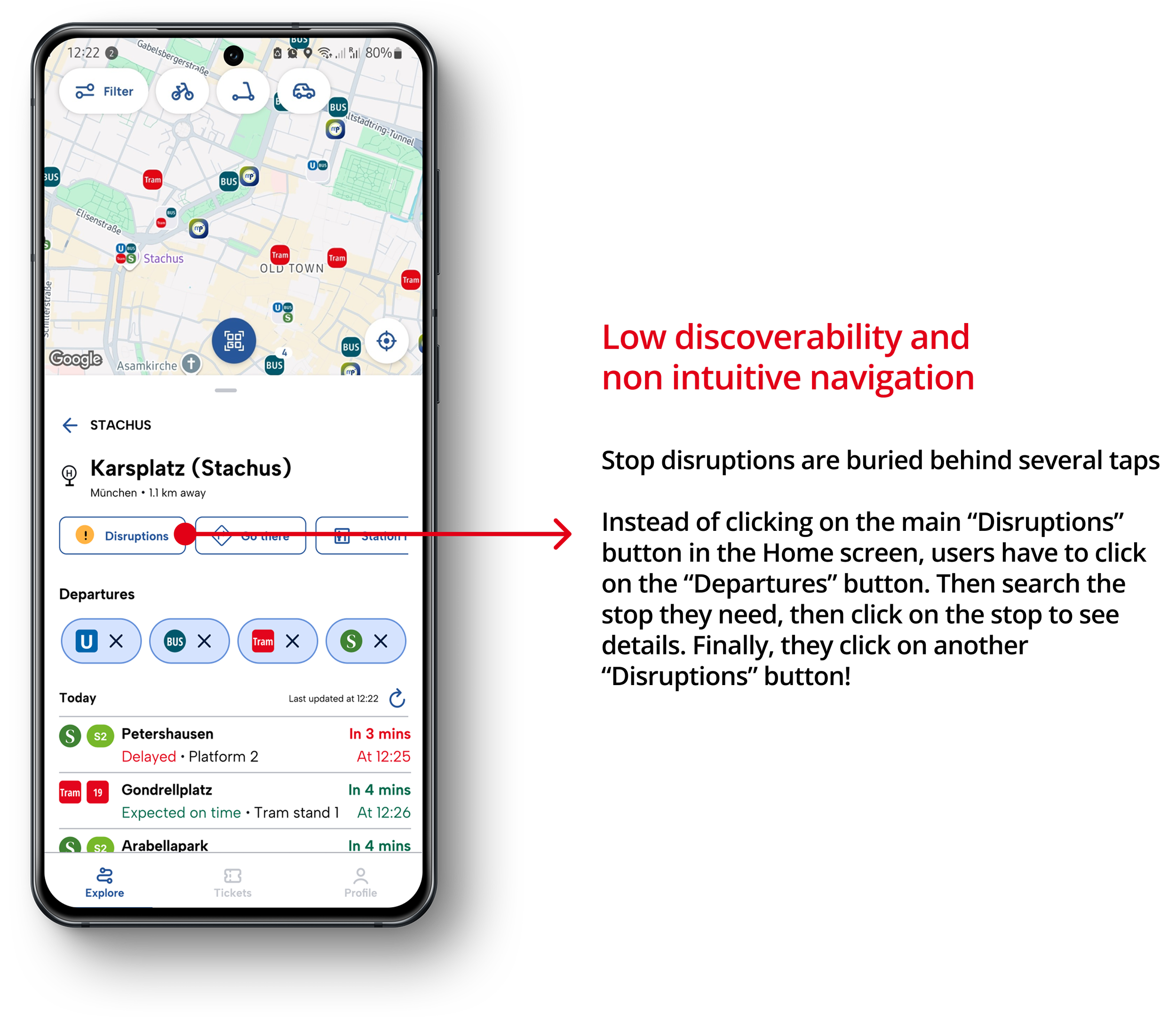
Before jumping into design solutions, I needed to look under the hood. To understand why users were so frustrated, I conducted an audit of the existing MVGO app. The audit revealed several usability issues that were creating friction for users trying to access disruption information.
These problems ranged from presentation issues to discoverability challenges that made it harder than necessary for commuters to get the information they needed.

MVG Fahrinfo
What the previous version offered
Given that users consistently praised the former app, I examined the disruption information in the previous version for comparison. This helped pinpoint which design decisions had improved - or not - the user experience in the past.


Design goals
Guiding principles for the redesign
Based on the usability issues identified, I established five key design goals to guide the redesign process. These goals focused on making disruption information more accessible, understandable, and actionable for Munich commuters.

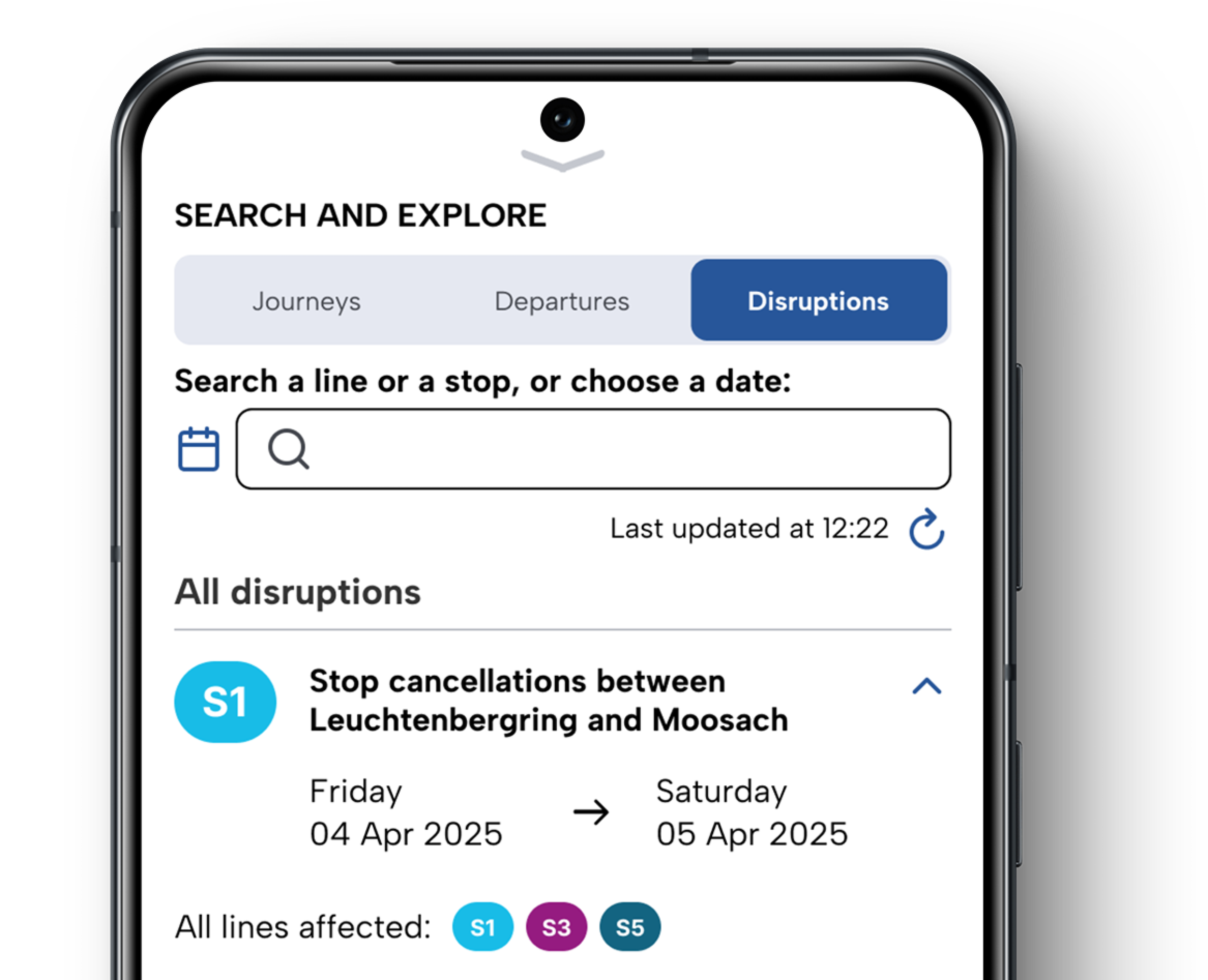
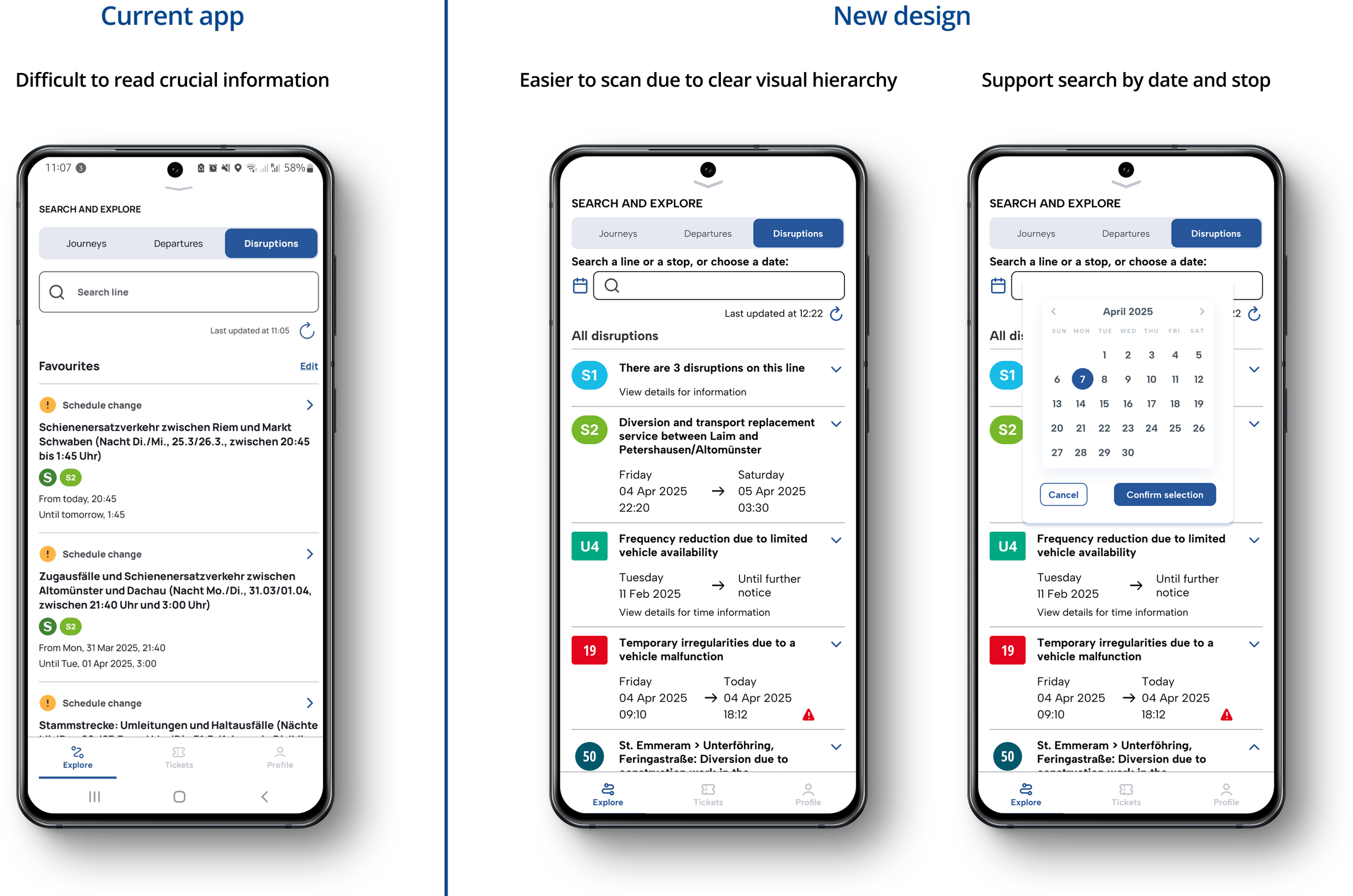
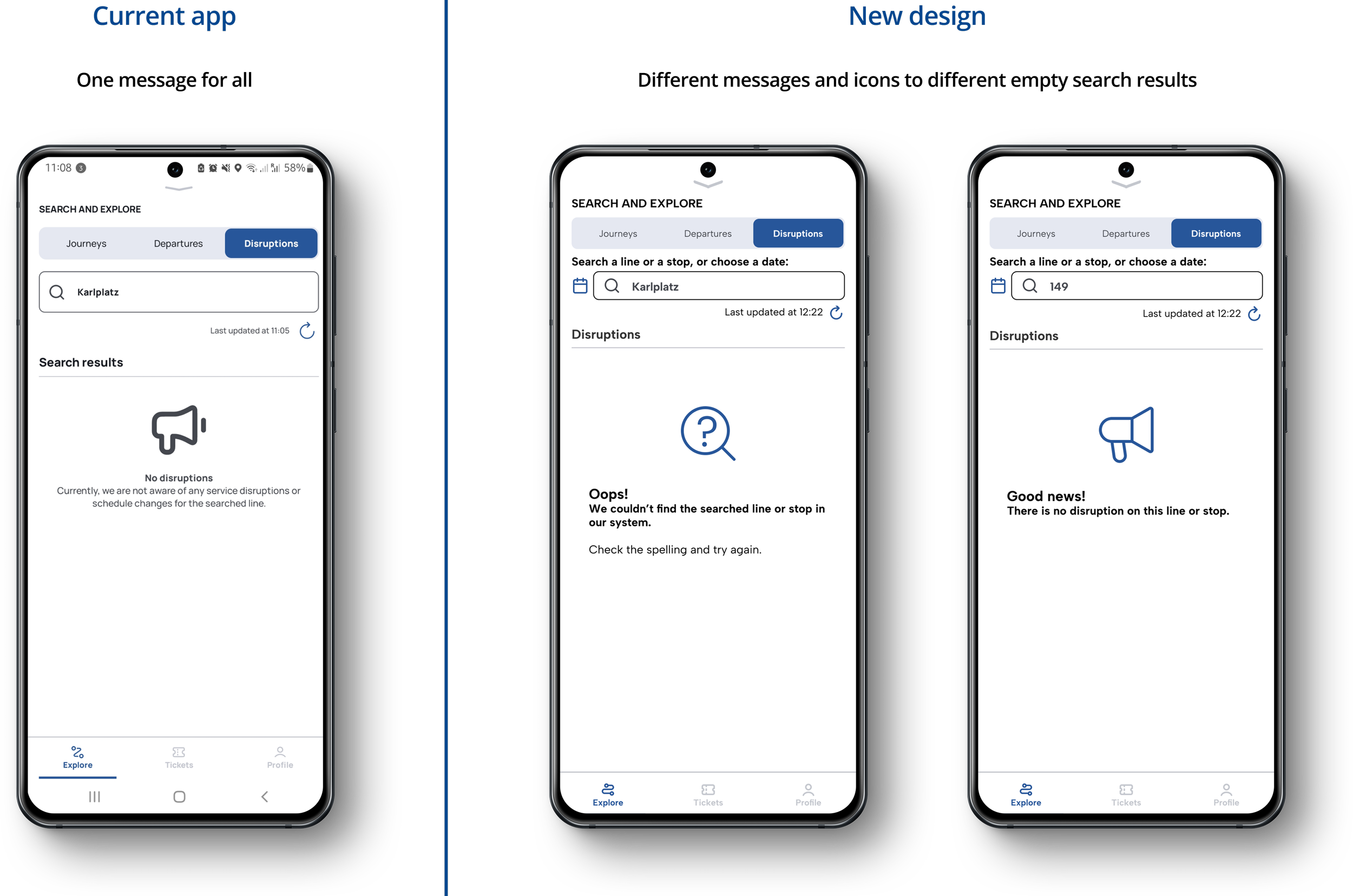
The improvements
Before vs After
The following comparisons demonstrate how I translated the design goals into tangible improvements across MVGO's disruption features.

Reflection
Lessons to take with me
Good time management involves planning. With just one month to complete the entire redesign process, staying focused on core user problems was crucial to delivering meaningful improvements.
Small, targeted improvements can have a significant impact. Focusing on specific usability issues rather than a complete overhaul proved more effective and efficient given the time constraints.
What I would do next
Test the redesign with real users - especially non-tech-savvy commuters. These sessions would help identify any remaining usability barriers and validate that the modifications truly work for all user groups.
Explore other disruption problems not yet addressed. The live-update information inaccuracy was a critical pain point, but I understood that solving it was more of an engineering or network communication problem than a UX Design task. Exploring this further could highlight alternative UX solutions, such as better error messaging or setting user expectations around data freshness.
Analyze the impact of the redesign. Measuring metrics like task completion rates and time-to-find-information would validate whether the redesign truly solved the core accessibility issues identified in user research.